I am hoping that by now, you have read our first impressions of the BlackBerry Z10 and all of the other reviews on this device. The device has officially been on the market in the U.S. for a couple weeks and adoption has been slow. That doesn’t tell the entire tale, but the U.S. usually leads the way with mobile adoption and is an indicator for the rest of the market. Now that I have spent about a month with the Z10, I have some more thoughts on the hardware and the future of BlackBerry.

Hardware
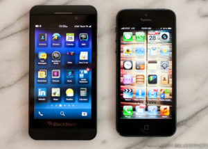
One of the many comments I received from people after seeing the Z10 for the first time was that “It looks like an iPhone.” Now I would like to go on record and say that I do not believe the Z10 looks like an iPhone, but the fact that this was a common response says something. I think the fact that the Z10 has no home button alone separates the design from the iPhone. Sure, the Z10 is black (or white) with rounded edges but I can’t possibly believe that this alone would make users think they were holding an iPhone. How about that red blinking LED notification light that I love so? How about those standard mini-USB and HDMI ports on the side?
The Z10 offers up a 4.2″ screen which at times, can be problematic. Certain content on websites or email can run over the edges. Luckily, BlackBerry 10 offers a “Reader” function that waters down content and lets it shine similar to that on the iPhone. I really wish Android would offer something similar because it can be quite useful. No mobile browser can render content on perfectly on every page so having “Reader” mode is a great fallback. The screen is still bigger than the iPhone that it looks nothing like, but iOS renders mobile pages much better than BB10 in its current state.
As I mentioned, there isn’t a home button, so other than the power button on top, the only other buttons you will find on the Z10 are the volume rockers and a button in between that has multiple functions that will launch voice commands or controls while listening to music. The rest of the device is navigated via gestures thanks to BB10.
Software
Not only are we seeing renewed hardware from BlackBerry, but the Z10 is the first device to launch with the BlackBerry 10 operating system. The Playbook offered a glimpse in to the power of QNX, the heart of BB10, but the Z10 is really the first device to unleash the power within.

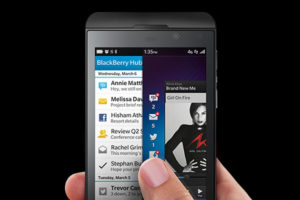
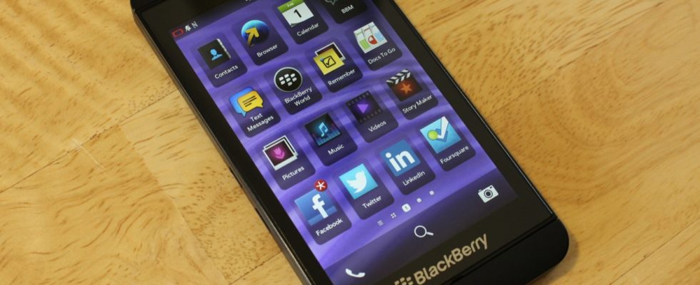
We have covered BB10 in our BlackBerry launch recap so to not sound redundant, I will just say that the simplistic approach of BB10 really speaks to how you can do a lot with a little. As you know, there is no true “home screen” in BB10. Swiping up from the bottom of the screen will launch “live tiles”, or eight of your recently used apps in the state you left them last. From there, you can either swipe right for a grid view of your apps or swipe left to access the BlackBerry “Hub”, an appropriate name for a combined inbox including messages from Email to BBMs to Facebook/Twitter messages. “Peek” is an amazing solution to not having a notification center. Being able to check on a new message without completely leaving an application couldn’t be easier.
But that’s pretty much the entire navigation in BB10. Simple. Effective.
The camera has some nifty tricks. “Time shift” is a bit gimmicky as it does not always work as advertised. Subjects on one side would sometimes end up being smushed after fixing blinking subjects on the opposite side. Other than that, you have a basic smartphone camera that takes decent photos. Nothing special.
One thing that really bothered me about BB10 was surprisingly related to messaging in the Hub. Communicating and message management was always something BlackBerry did very well. I have always and still believe that there is no better communication tool than a BlackBerry, but why can’t users switch between new messages easily? When finished reading a message, you have to return to the Hub before entering a new message. You cannot transfer from one message directly to another. This is a problem, and I hope one that is on the short list of fixes for future software updates. The fact that GMail on BlackBerry still doesn’t sync across all devices causes even further frustration.
Network
Although currently available from everyone except for Sprint, my Z10 was provided graciously by AT&T. The device didn’t come with in your face branding on the front and performed really well in the DC region. AT&T has been steadily improving in this area and LTE on the Z10 was strong throughout my time with the device. AT&T still has the fastest network around and if it wasn’t for the pricing, I would switch to AT&T fill time. Yes, Verizon is just as expensive but I have had it forever and old habits die hard.
Overall
One of the best headlines I have read so far about the BlackBerry Z10 is this one by ZDnet’s James Kendrick. The Z10 does give BlackBerry a lot of hope for the future. This is certainly not the BlackBerry of old or anything OS 7 and before. But I am just not sure that this device is enough to make a real splash in the smartphone market today. Apple and Android’s stronghold is boosted by their app ecosystem and support from developers. BlackBerry has invested a lot in its developers, but many of the 200,000 apps in App World are garbage and some of the big names are still missing. If BlackBerry can tighten up its app presence and work on better GMail integration, I could make the switch back to a BlackBerry full time. Until then, there’s always the Q10 and the next big thing.

