We tried so hard to hate iOS7, and I mean tried. Pre-launch, we had heard developer complaints, ruminations of irritating changes to basic functionality, and the negative hype was oh so tasty, we couldn’t wait to chomp down. But post-release, we just couldn’t find much of anything wrong with the upgrade. We asked our friends, our colleagues, IT friends. Instead, we got what you’ll see below. Here’s a list of why the new iOS7 is amazing and our Android-loving writers have even lost their contempt for it.
1. It’s Pretty
One of our readers told us the following: “How I described iOS 7 to a friend: It’s really gay. No, I don’t mean in some derogatory way. In a bright, colorful, rainbow-y way.”
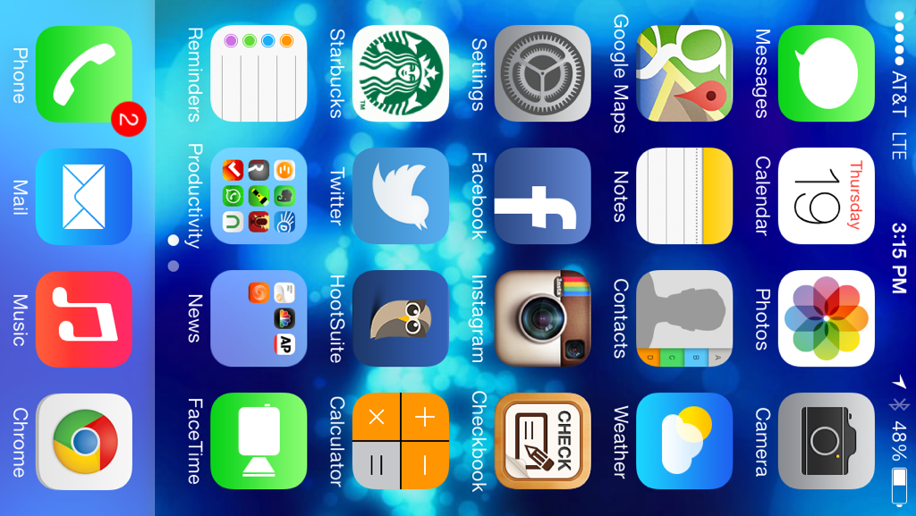
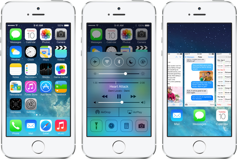
We think he had it right. Hands down, iOS7 is damn bright, bubbly, and gorgeous. No one can deny the space shots Apple includes as wallpaper in its software are attractive, and this iteration did not shy far from that notion. This mobile OS is clearly one of Apple’s finest yet in terms of aesthetics. The larger, rounded, BRIGHT icons simply POP off the screen. Updates to cleaner typography (Late-Jobs’ forte) make it even cleaner and more pleasurable to read with. But our favorite is the aquamarine hue, which is given to so many things: icons, wallpaper, and the new Control Center. If you hate teal or blue, iOS7 probably is not be for you. Of course, you can always find a way to change the theme. Right, jailbreakers?
In addition, we also received a lot of comments about how futuristic and flat iOS7 looks, but check this out: Apple has added an iOS7 “parallax effect” which gives the display a bit more depth. Using its accelerator to detect any off-kilter movements, the icons on your home screens will be given a bit more three-dimensional perspective. It’s a pretty cool trick on the eye, and “Freaky” is the general response you’ll hear when pointing it out to your friends.
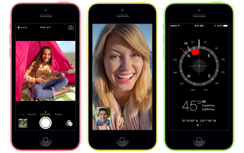
2. It’s more intuitive
Wait, how could there be more intuition in this update? Maybe it’s not as difficult as thought. Nevertheless, the new and improved Control Center is probably the most notable change users have touted. Why is it improved? You can actually access your alarms, calculator, camera, and music in one swipe. Much like Android and Windows’ own notification bars, settings are just one finger swipe away, and it’s much appreciated. Another weird quirk we just found is that you can now attach more than one photograph to an email in iOS7’s Mail app. Figure that one out.
3. iOS7 rips off other mobile OS (Android, Windows, WebOS)
This sounds like a slight, but it’s also a good thing. Android is a mess of an OS that’s become so bloated and complicated that even its upgrades are more confusing than reasonable. But that doesn’t mean it doesn’t have good functionality for its most basic uses, especially its Control Center as listed above which added easy access to controls.
In addition, Palm/HP’s WebOS multitasking tool called Switcher was obviously borrowed for iOS7. Users can now scroll through currently running applications as “cards,” tap to switch from one to another, or simply swipe away to close it. Android has also had similar features since, and it’s one that’s incredibly convenient for managing tasks and will prove useful to iPhone owners.
4. The Keyboard
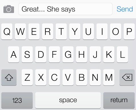
Typing has always been pretty cool with iOS. By far in our use of smartphones, typing was always more swift and accurate on an iPhone than any other device. Now users are saying that typing is even faster on iOS7. With Apple’s brand new keyboard layout, it’s more spread out and much easier for those with larger hands, and maybe even more visually interesting depending on your thoughts. Still, it doesn’t have Swype typing, and that’s one criticism Android will continue to win out on.
5. The Camera
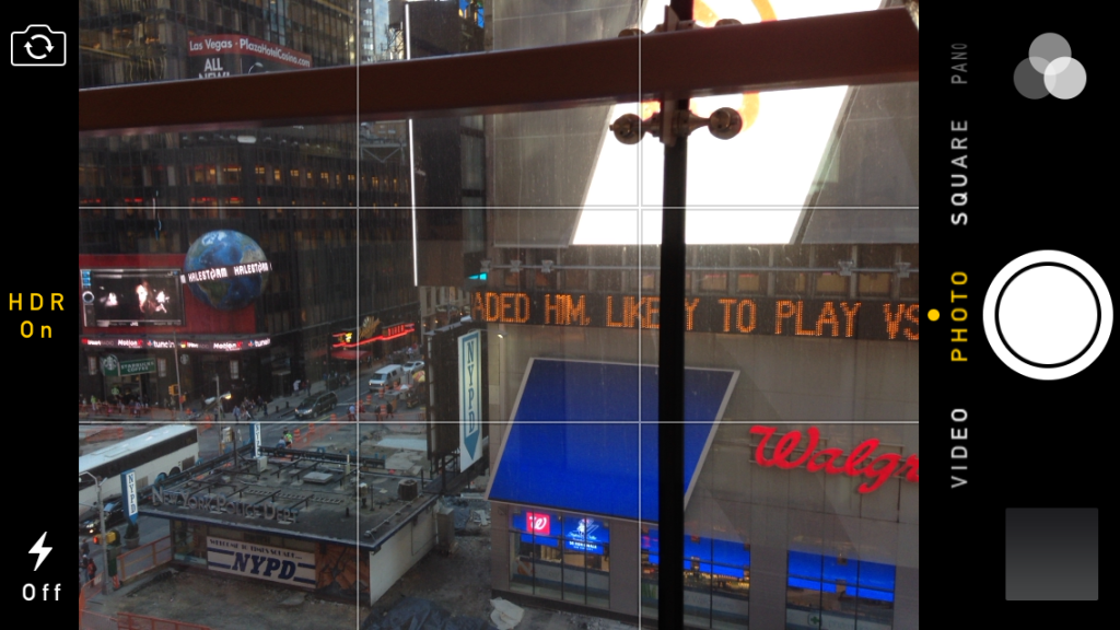
Apple’s new camera is a bit more complicated, but it’s about time considering its amazing ability as a point and shoot. Some of the new features may look intimidating, however it’s 2013 and Apple just added HDR mode (three photos taken to produce one high-quality photograph), slo-mo, and photo filters. About time, Grandpa Tim Cook. More importantly, a burst shot mode has been added, a fan favorite for anyone known for sneezing, squinting, or laughing during a group photograph. For a state-of-the-art smartphone camera that competitor smartphone manufacturers would kill for, it’s nice to finally see Apple’s software be just as competitive. Oh, and did we mention that photo filters can be “squared?” How Instagram-friendly of these guys.
6. Siri is more functional
Siri was great for the first two weeks of with the iPhone 4, but when’s the last time she did anything but Google the meaning of life or send a text for you? She couldn’t change your phone settings, that’s for sure. But look at her now, she has multiple voices (men too?), and she can turn on Bluetooth, Wi-Fi or even bring up cards of information cards from sources like Twitter and Wikipedia much like Google Now.
7. You can block people’s numbers
Rather than going directly to your phone company to block your crazy ex’s phone number, wouldn’t you rather just click a button on your phone? No, we don’t mean “go straight to voicemail.” iOS7 actually allows you block phone calls in its privacy settings. This is a first for iOS and definitely a real need for this generation of constant connected-ness. The setting is a bit of a dig, but within Settings>Phone you’ll find access to this feature. You have the option to block SMS/Facetime/Phone calls, but if you block someone in Phone settings, Face Time is blocked automatically as well. See, now you can sleep easy knowing that the guy/girl you stood up last week will never be able to call you again.

