Update: Facebook has come back to us and noted that the updates to News Feed were announced on March 7 and changes to Facebook Pages on March 10. We are still waiting to hear any official notes on Timeline updates.
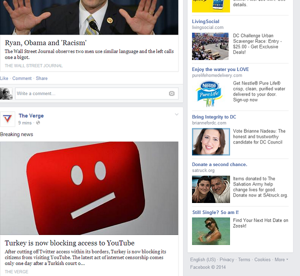
We all know this first world problem. Just when you’re getting used to Facebook again (remember when you hated Timeline), Facebook updates its layout. As it just so happens, it may have changed again in the past few weeks in a staggered rollout. Many users are waking up to a slightly boxier layout with the zigzagged story template apparently eradicated altogether from the News Feed, Pages, and Timeline. The worst part? They’ve added Georgia font to media posts (news links and promotional stories) and are mixing it with the rest of the arial typefaces.
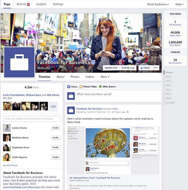
Facebook offers its utmost excitement to users above their page, simply stating, “New! Stories have a streamlined layout with bigger photos!”
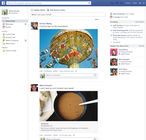
As you can see in the above Pages screenshot by Facebook, borders between on stories seem to be more contrasted. In addition, below on the updated News Feed pictures of everyone’s lunch and new haircut are slightly larger and standout-ish (although they were already pretty overemphasized). Even chat looks more like its own sidebar, with a cleaner font and a grayed-out backdrop. The changes seem to put emphasis back on everyone’s stories down the main drag, highlighted with a white. As mentioned, Georgia font is also making an appearance, specifically in news stories. And it’s ugly.
“I think it’s Georgia. It’s so ugly. And I hate the gray background. It seems extra cluttery now,” chimed one Facebook user.
However, the one unnoticed and important change (at least to us) is that long-abhorred zig-zagged story layout–it’s gone. And while it may not have been visible on your page for recent stories already, it’s not even shown when clicking on older Timeline stories. This is an interesting change considering it still has yet to hit all Facebook business pages. Facebook announced a one-column layout on Facebook “pages” in order to be consistent with News Feed stacking stories one on top of the other on March 10. You can see a depiction of the original New Ffneeed for contrast below.
“This week, we’ll begin rolling out a streamlined look for Pages on desktop that will make it easier for people to find the information they want and help Page admins find the tools they use most,” noted Facebook on its Newsroom page.
Nevertheless, after this announcement, Facebook’s updated layout is still not available to all users of “Pages.” Users must join a waitlist to receive these updates.
The last change to Timeline was announced on March 7 last year, which also noted emphasis on photos and added informational categories including Books and Movies.
As for the current changes to regular user pages, we have yet to hear Facebook’s commentary. Can you spot any major differences on your own timeline this morning? Since Facebook’s announcement of purchasing Oculus VR yesterday for $2 billion, no Facebook release has been posted. We’ll continue to update this story, but please let us know in the comments below if we’re simply going crazy.
Via: InsideFacebook
Source: Facebook


