HTC’s new flagship is here and its name is the same. But before we start the review on the HTC One (M8) with AT&T, a brief history lesson is required. Back when the Tech Void team met the very first HTC One and One Mini in 2013, we were astounded that Android smartphone manufacturers had finally caught up with Apple. A unibody aluminum Android had been basically unheard of before 2013, which is actually a bit pathetic.
So when we got our hands on HTC’s shiny silver smartphones, we were overjoyed. Unfortunately, despite its beautiful physique and slimmed-down, they were still slightly bogged down with HTC Sense, carrier bloatware, and very hot batteries. Nevertheless, this isn’t to say that the devices came up short. The One was fast, had a beautiful 4.7” Super LED screen, and performance that kept paces with every other leading flagship phone on the market. The One Mini, a more compact version was a bit worse for wear in comparison, but both were premium devices in their own right scoring at 7 or above (out of 10).
So how about the NEW One lineup? Will AT&T’s HTC One (M8) stack up to its previous iteration? Read on to consume the full review.
The Display
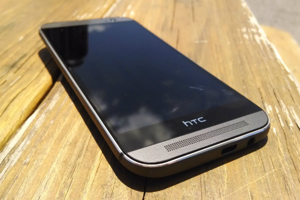
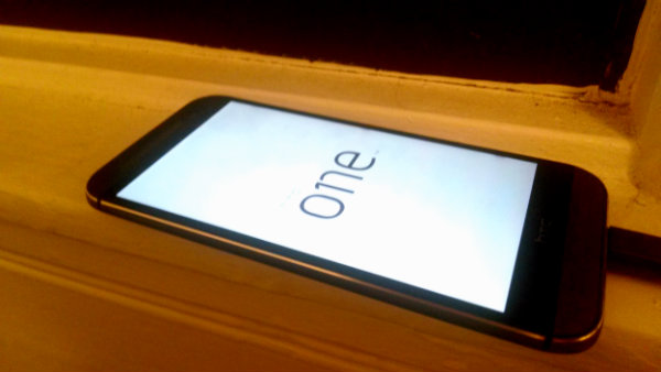
Let’s start this off with the most important thing; the HTC One has one of the most beautiful smartphone displays I have ever seen. It’s actually the same Super LCD3 the original HTC One featured. However, it’s a slightly larger 5” with a gorgeous 1080×1920 resolution. It has its usual stupendous 16 million colors, and when they’re hyper-contrasted (and it tends to be), it’s an overall eye-popping experience. In fact, with its 1080p HD experience, watching Netflix, taking pictures and filming video almost feels too luxurious for handheld tech. It might as well be your home’s HD flat screen. Honestly, using the One’s camera viewfinder alone made me question why real life isn’t this pretty.
Design
The One M8 is another beautiful and premium device designed by HTC, and it comes in at a perfectly thin .37”. It’s a bit hefty at 160 grams compared to some of the smaller handsets, and that’s due in part to the addition of the 5” screen. For instance, the previous One was 143 grams while the Moto X comes in at a featherweight 130. Nevertheless, the M8’s heft adds to its incredibly sturdy feeling. Its industrial brushed aluminum body didn’t hurt this thought either, nor the display’s impossible to scratch Gorilla Glass 3.
Compared to the previous generation, the bezel and corners are much rounder and comfortable to grip. And rather than a light gray, the aluminum body (as mentioned) has a dark and brushed metal sheen to it, which catches the light as you rotate the One. You’ll find that the back of the phone arcs a bit, much like Motorola devices. This makes for a definitely more comfortable placement in the hand.
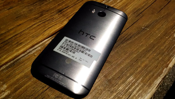
In addition, two black stripes run along the top and bottom, breaking up the monotony with some style. Per usual, HTC put its Boomsound speakers on the front of this device for easy listening and viewing media with quality surround sound. Some have complained the device is more slippery, but with the added curvature, I definitely prefer the M8 even with the larger sizing.
Hardware
The HTC One has some new hardware on board this time around. It comes with a state of the art quad-core 2.3 GHz snapdragon processor, which packs an incredible punch along with its Adreno 330 GPU. This is exactly the same build for the Samsung Galaxy S5. The inclusion of such chips means any Android gaming or media consumption won’t even make this phone sweat. You should note that the previous One already had a 1.7 GHz quad-core chip, and it was already blazing. Temple Run, Netflix, running a thousand apps at a time–no matter what you decide to do, the M8 is not going to lag your day, especially with base OS of Android 4.4.2 KitKat. 2 GB of memory are included and 16 GB and 32 GB models are both available. The bonus is that the M8 actually comes with a MicroSD slot unlike the previous generation. It also accepts a generous 128 GB of storage.
User Experience
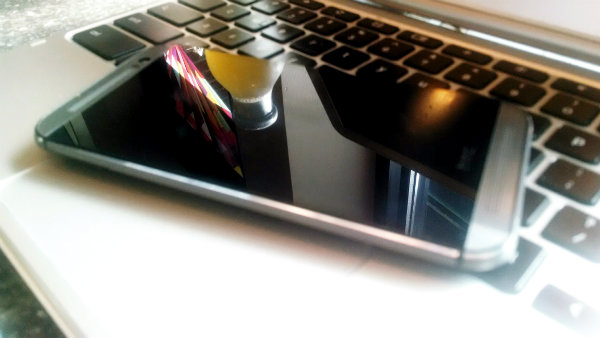
As mentioned, the One delightfully comes with Android 4.4.2 KitKat. Of course, being this is HTC, it also comes with Sense 6–the modified skin on top of Android. This means the home page comes with BlinkFeed (just like the previous generation), a fairly useful news and social media content aggregation app. It also comes with its own modified Chrome browser, Boomsound customizations, and its Zoe Camera with dozens of shooting and editing options. There’s also the run of the mill AT&T carrier apps one would expect.
However, the only real annoyances I came across were about HTC Sense 6, and they were minor. The settings menus were left close enough to stock Android that they remained useful. This meant easy access to settings with a two-finger swype that you actually use. Wifi, Brightness, Do Not Disturb Mode, etc. take no effort to find, and that’s great. The only other real issues with Sense have to do with the HTC gallery browsing and the camera application, which doesn’t allow easy finger swipe photo-deletion or an easy find of the basic camera roll. Also, as a personal preference, I absolutely hated the standard keyboard on the One. The keys are muddled together, which is technically great for Swype typing, but it’s quite ugly, and I found myself feeling distracted and sloppy whenever sending a text or email. It was accurate enough, but it just didn’t jive. I’d suggest downloading any Google Play Store alternatives to remedy this.
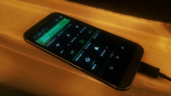
Carrying the One around wasn’t much of a hassle. It’s thin enough to not feel bulky, and even at 5″, it’s not overly offensive in your pocket. However, the power button on the One is up top, which can be annoying to get to considering its grand height. Thankfully, HTC does you to double tap or hold and swipe up to unlock the screen. You can also conveniently unlock to specific applications, including the camera. This is great for spontaneous photo-ops. When you’re on the home screen, BlinkFeed is one swipe to the left. The application definitely grows on you, giving you access to your social media and news interests, all completely customizable. It’s better than Flipboard in my opinion, and it even trumps Google Now’s general newsfeed.
Call quality using AT&T with the M8 is perfectly fine, and WiFi and 4G speeds were never a notable issue. During the camera test, I constantly was shooting and uploading video and pictures to YouTube and Google Drive in seconds. App updates and installs are practically instant, and video playback on Netflix and YouTube is bright and brilliant. The stereo speakers included are a definite upgrade from the previous generation’s. HTC claims they’re a decent amount louder too. They didn’t sound tinny or annoying, despite the aluminum body, which was a major plus. Still, in an age where everyone is buying headphones and portable bluetooth speakers, does anyone really care for literal stereo sound on a smartphone? To each his own.
Battery Life
The M8 comes with a non-removable 2600 mAh battery (much larger than the previous 2300 mAh). Considering the powerhouse the Super LCD on the smartphone is, we didn’t expect superb life on the battery life, and technically, I couldn’t say we got it either (at first). Average use without any battery saving methods got me through the work day or a day out at the Nationals baseball game. I’d generally have to charge after 10-12 hours. However, there is quite an exciting solution to these juice woes. HTC offers two battery saving modes. The first one kills CPU-use, limits data consumption, cut down on brightness, and even tempers vibration. The second, Extreme Power-Saving Mode, HTC claims will suck the remaining 10% for about another day longer, allowing for up to 30 hours of standby. This feature is perfect for those late night texts and Uber rescues. The upgrade of the snapdragon chip helps add to this battery efficiency, making this a definite improvement over the original model.
[slideshow_deploy id=’5172′]
Camera
HTC has brought its emphasis on photo quality rather than size with its 4-‘Ultrapixel’; 1080p HD video. Yes, that means the rear camera only 4 megapixels. But HTC has also included second lens on the back for better depth sensing and refocusing features using its camera software. It’s an absolute joy to use. This camera shoots just as fast as an iPhone 5S and with arguably superior results. Noise and saturation are almost nil in any decently lit-environment. In my time reviewing smartphones, I haven’t seen a higher quality camera since the Nokia Lumia 1020, and that’s at 41-megapixels. Also, since the One’s display is so beautiful, photos and videos turn out exactly as you thought they would—absolutely perfect. They do tend to be a bit hyper-contrasted like Nokia’s camera shots, but who wants to live in a standard definition world these days? HTC’s camera software also offers a lot of unique options and setting modes for shooting, editing, and refocusing photos. Zoe Camera animation, photo filters, etc. They’re all very fun to play with.
So where’s the gripe? It’s “Selfie Mode.” Yes, HTC’s One camera actually includes Selfie Mode for using the front-facing 5-megapixel camera. Sure, it’s tacky, but what else is a front cam for? The problem isn’t the name, though. It’s that this mode is actually requires a timer to pose. This means you’re going to sit there for two seconds every time you take a stupid duck lips selfie. This is great for posing with friends at a bar, but what if you just want to take a quick snap on the train of your spinach teeth without getting caught? I actually recommend installing Android’s new Google Camera app, so you can use your front cam to your liking.
Beyond this minor hiccup, using the One’s cameras are perfectly fine. You can snap dozens of photos at once with a simple hold of the shutter, and everything turns out great, even in low-light conditions. Video Skype worked perfectly with little lag over Wifi. To get a real look, I took the camera to a Washington Nationals game and photos and 1080p video turned out absolutely fantastic. You can check out the video and slide show above.
Overview
The Second generation of the HTC One (M8) is a supreme phone. Rumors of a better and amped up version (One Prime) are rumored, but as of now this is the HTC flagship and it has not disappointed us. This phone is large at 5″, but it’s not a phablet by any means. HTC Sense 6 has improved and come closer to stock Android than it has ever been, although it still leaves something to be desired for that full Google experience. That being said, this smartphone has one of the fastest processors on the market, the most beautiful screen we’ve encountered, and a camera that matches up with Nokia’s best. Also, the inclusion of two battery-saving modes to squeeze that extra juice out even longer is an absolute clutch feature and selling point for the M8. Add the ability to add your own 128GB of storage on MicroSD, and you have one incredibly useful and elegant phone that will last you long past any contract date. We can’t say enough how much we enjoyed taking this AT&T model for a spin. The HTC One M8 comes in Gunmetal Grey, Silver and Rose Gold for $199.99 on contract with AT&T and all other major carriers. Without a contract, it’s going to run you $699.99.
9/10
–

